Product | B2B dashboard

FleetOps

FleetOps

FleetOps

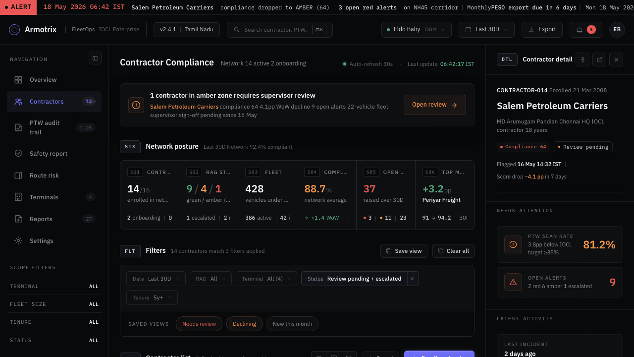
A dark, Linear-style safety dashboard that turns wearable fatigue data into a defensible regulatory paper trail for one of India's largest fuel networks.

A dark, Linear-style safety dashboard that turns wearable fatigue data into a defensible regulatory paper trail for one of India's largest fuel networks.

A dark, Linear-style safety dashboard that turns wearable fatigue data into a defensible regulatory paper trail for one of India's largest fuel networks.

Role

Product design | Design systems | B2B dashboard design

Timeline

Design phase, snapshot 2026-05-23

Stack

Self-contained HTML | CSS | JS mockups, no backend

Platform

Web (local HTML mockups)

Context

Wualt (also referred to as Armotrix in earlier project docs) builds a wristband that reads a tanker driver’s HRV, EDA, SpO2 and skin temperature and turns it into a Fatigue Score from 0 to 100. The client is a national petroleum distributor, and the named end user is the DGM who owns regulatory reporting and signs the monthly PESO safety submission. This is the client’s Enterprise surface, one of five surfaces planned for the wider Wualt FleetOps product, and the one that had to convince the client the platform was worth trusting with a safety-critical workflow.

Problem

The client’s existing Permit-to-Work check only captures a driver’s state at the moment of departure. It misses everything that happens in the 6 to 16 hours after that, on stretches of Tamil Nadu highway where fatigue-related incidents actually happen. The dashboard had to make a continuous physiological signal legible and actionable to one DGM, while proving to a regulator (PESO) and a privacy team that raw biometric data never left the wristband. It also had to stop looking like a generic ops dashboard: the first pass read as dense and telemetry-heavy, closer to SAP than to something a DGM would trust as premium-engineered.

Approach

Eight cross-linked screens were built around one DGM’s actual day: Overview, Contractor Compliance, PTW Audit Trail, Network Safety Report, Route Risk Index, Terminals, Reports and Exports, and Settings. A single running narrative, one contractor (Meridian Fuels) sliding into an amber compliance score and one driver’s PTW breaching red mid-journey on the corridor, was threaded through all eight screens so the system could be reviewed as one continuous case rather than eight disconnected mockups. The aesthetic went through a real pivot during the work: early passes used a dense mono-coded terminal look, but the direction that shipped moved to a Linear-style dark palette (bg #08090a, single cyan accent #7170ff) with glass surfaces and Plex Sans as the default body font, mono reserved only for identifiers and codes. Iteration ran in visible passes: fixing accent-color overuse, building a real three-tier button hierarchy, replacing a disappearing sidebar with a VS Code-style icon rail, and propagating every fix to all eight files so no screen was left behind.

Outcome

All 8 screens for the client’s Enterprise surface are built as self-contained HTML mockups (no build step), fully cross-linked, with a consistent design system and a 6-tier responsive cascade. Per the project’s own tracker, this is 1 of 5 planned Wualt FleetOps surfaces; the other four (Driver App, Contractor Supervisor Dashboard, Contractor Top Management App, Armotrix Internal Ops) were not yet designed as of this snapshot. No claims are made here about live deployment, real user testing, or the client’s actual sign-off status beyond what the project docs describe (a design deliverable, not a shipped or client-approved product).

Decisions | Reasoning
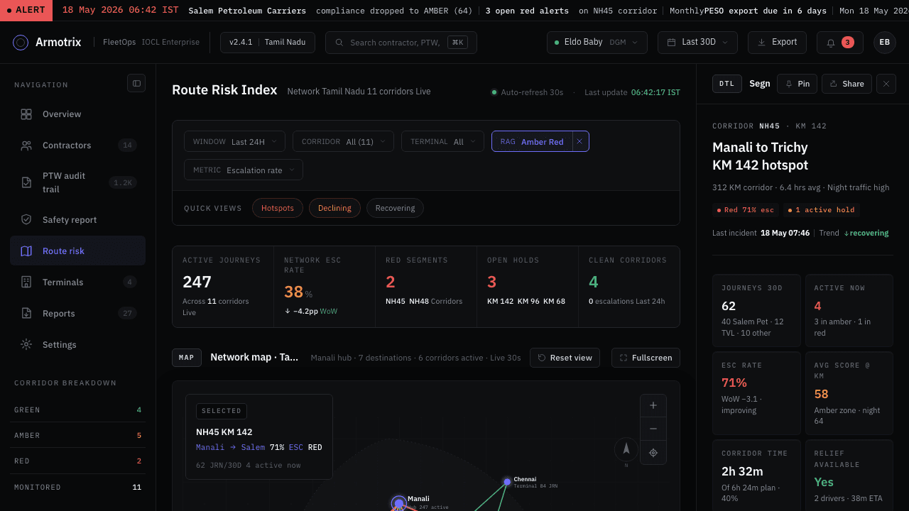
Pivoted the aesthetic from a dense mono-coded terminal look to a Linear-style dark theme with one cyan accent and glass surfaces.

Pivoted the aesthetic from a dense mono-coded terminal look to a Linear-style dark theme with one cyan accent and glass surfaces.

The original direction felt generic and overloaded, closer to a wall of telemetry than a serious product. For a DGM in a safety-critical industrial context, restraint reads as more credible than density. Linear's dark palette (bg #08090a) and a single accent color made the dashboard feel premium-engineered rather than SAP-like, per the project's own design decisions log.

The original direction felt generic and overloaded, closer to a wall of telemetry than a serious product. For a DGM in a safety-critical industrial context, restraint reads as more credible than density. Linear's dark palette (bg #08090a) and a single accent color made the dashboard feel premium-engineered rather than SAP-like, per the project's own design decisions log.

Flipped the typography default from monospace to sans, keeping mono only for identifiers.

Flipped the typography default from monospace to sans, keeping mono only for identifiers.

Early drafts used Plex Mono everywhere, including body copy and chart annotations, which made the product feel like a terminal rather than something readable. Sans became the default for body text; mono was kept strictly for codes, IDs, hashes and uppercase labels, so mono itself became a signal that a value is exact and verifiable.

Early drafts used Plex Mono everywhere, including body copy and chart annotations, which made the product feel like a terminal rather than something readable. Sans became the default for body text; mono was kept strictly for codes, IDs, hashes and uppercase labels, so mono itself became a signal that a value is exact and verifiable.

Built a strict three-tier button hierarchy (solid cyan primary, bordered glass secondary, text-only tertiary), with at most one primary action per screen.

Built a strict three-tier button hierarchy (solid cyan primary, bordered glass secondary, text-only tertiary), with at most one primary action per screen.

User feedback was direct: five or more button styles all looked similarly purple with no visual hierarchy guiding the eye. Restricting the accent color to two roles (primary action, active/current state) and giving every other interaction a neutral treatment made the primary action locatable at a glance.

User feedback was direct: five or more button styles all looked similarly purple with no visual hierarchy guiding the eye. Restricting the accent color to two roles (primary action, active/current state) and giving every other interaction a neutral treatment made the primary action locatable at a glance.

Replaced a fully-hiding sidebar collapse with a VS Code-style 56px icon rail (Activity Bar pattern).

Replaced a fully-hiding sidebar collapse with a VS Code-style 56px icon rail (Activity Bar pattern).

The user explicitly rejected a sidebar that disappeared on collapse, since it removes navigation context. The fix keeps every nav item visible as a 40x40 icon tile, with the active tile using a faint cyan background plus a vivid cyan icon stroke, so collapsing means minimizing density, not losing your place.

The user explicitly rejected a sidebar that disappeared on collapse, since it removes navigation context. The fix keeps every nav item visible as a 40x40 icon tile, with the active tile using a faint cyan background plus a vivid cyan icon stroke, so collapsing means minimizing density, not losing your place.

Made the right context rail fixed at 320px with no collapse toggle, while the left nav stays collapsible.

Made the right context rail fixed at 320px with no collapse toggle, while the left nav stays collapsible.

The right rail always shows detail for whatever is selected in the center column. An earlier version added a matching collapse toggle for symmetry, but that meant losing the relationship between a selected row and its context. The fix treats the two rails by role, not by symmetry: navigation can compress, context cannot disappear.

The right rail always shows detail for whatever is selected in the center column. An earlier version added a matching collapse toggle for symmetry, but that meant losing the relationship between a selected row and its context. The fix treats the two rails by role, not by symmetry: navigation can compress, context cannot disappear.

Threaded one running incident (Meridian Fuels' compliance drop, driver D. K.'s mid-journey RED breach at corridor KM 142) through all eight screens instead of designing each screen with independent sample data.

Threaded one running incident (Meridian Fuels' compliance drop, driver D. K.'s mid-journey RED breach at corridor KM 142) through all eight screens instead of designing each screen with independent sample data.

Per the project's own PRD, this was described as the test that proves the eight screens work as one system rather than a deck of disconnected mockups: the same contractor, driver and corridor recur in the leaderboard, the PTW audit log, the route risk map and the terminal dispatch board, so a reviewer moving through the screens is following one case, not looking at eight demos.

Per the project's own PRD, this was described as the test that proves the eight screens work as one system rather than a deck of disconnected mockups: the same contractor, driver and corridor recur in the leaderboard, the PTW audit log, the route risk map and the terminal dispatch board, so a reviewer moving through the screens is following one case, not looking at eight demos.

Results

One of five planned Wualt surfaces, delivered as fully cross-linked, self-contained mockups; not a claim of live deployment or client sign-off.

Next project